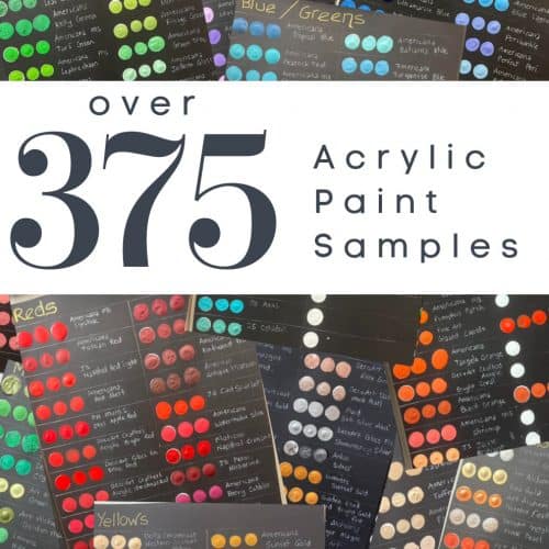
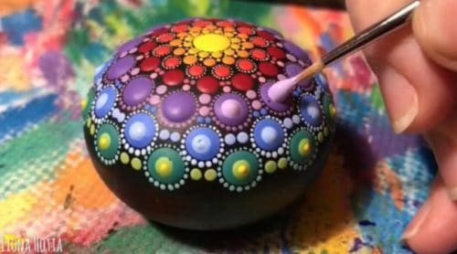
Whether you are going to start some beautiful dotted mandala art, create on a canvas, or our favorite… paint a rock, it always start by picking acrylic paint colors!
This page contains affiliate links which means if you make a purchase using the link, I could receive a commission. Check out all the details here.
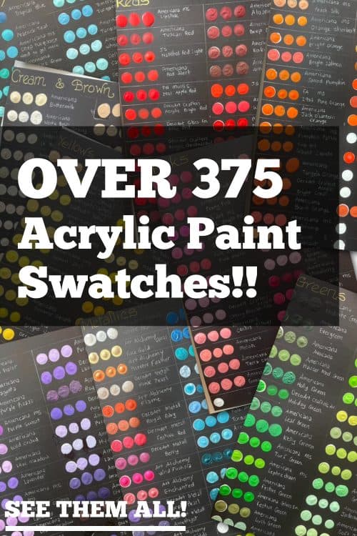
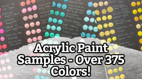
Before we go any farther I have to give a big Thank You to the lady behind this amazing content! I stumbled onto Lindy’s post in one of the dot mandala groups I am in. She created these wonderful acrylic paint swatches as a resource for other painters!
Lindy is an amazing artist! I hope you take a minute to check out her art! Find her on Facebook at Pet portraits by Lindy Clarkson & Beautiful paintings by Lindy Clarkson or on TikTok!
About Acrylic Paints
Below is a list reasons why so many artists choose acrylic paints for their art and craft projects.
- Water-Based: Acrylic paint is water-based, making it easy to clean up and mix with water for various effects.
- Quick Drying: It dries fast, letting you build layers or finish your masterpiece swiftly.
- Versatile Surfaces: Acrylics adhere well to surfaces like canvas, paper, wood, fabric, and more.
- Color Mixing: Start with just a few colors – red, blue, yellow, plus white – and mix to create a wide range.
- Layer Love: You can layer colors easily, allowing for intricate details and vibrant depth.
- Opacity Control: Alter opacity by thinning with water or using gel mediums for thicker consistency.
- Longevity: Acrylics are durable and resistant to fading over time.
- Flexible Finish: Choose from glossy, matte, or satin finishes to suit your style.
- Brushes Galore: Versatile for various brush types, offering textures from fine details to bold strokes.
- Overpainting: Correct mistakes by painting over them once they’re dry – no stress, just artistic freedom!
Picking Paint Colors
Choosing paint colors can be exciting and fun! Here’ are a few things to consider when picking your palette:
- Purpose and Mood: Think about the purpose of your artwork. Are you aiming for a soothing vibe, vibrant energy, or something in between? Colors evoke emotions, so pick ones that align with your desired mood.
- Color Wheel: Understand the color wheel basics. Complementary colors (opposite on the wheel) create contrast, while analogous colors (neighboring) offer harmony.
- Color Harmony: Stick to a limited color palette for a unified look. Triadic (equally spaced on the color wheel) or monochromatic schemes can create pleasing harmonies.
- Contrast: Consider the contrast between your background and main elements. High contrast can make elements pop, while low contrast can offer subtlety.
- Lighting: Think about where your artwork will be displayed. Natural and artificial light can affect how colors appear.
- Subject Matter: Reflect on the subject of your art. Natural scenes might call for earthy tones, while abstract pieces could be more experimental.
- Personal Preferences: Your personal taste matters. Choose colors that resonate with you and reflect your style.
- Experimentation: Don’t be afraid to try unexpected combinations. Sometimes, the best results come from taking risks.
- Test Swatches: Always test colors on a separate surface before committing to your artwork. Colors might look different when applied.
Remember, there are no hard rules – it’s about what speaks to you and your artistic vision. Happy color hunting!
Shop for Acrylic Paint on Amazon
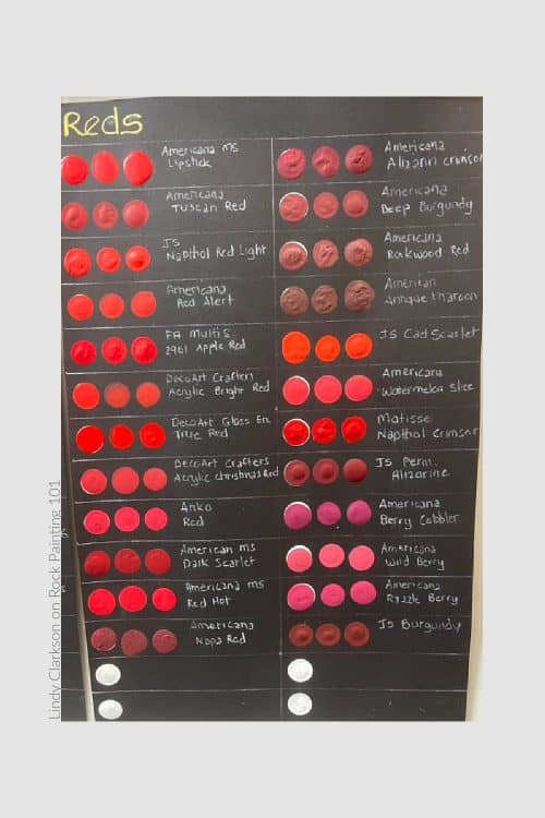
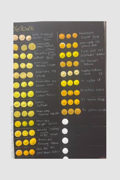
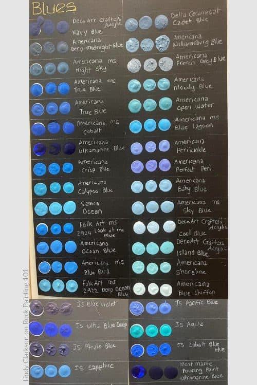
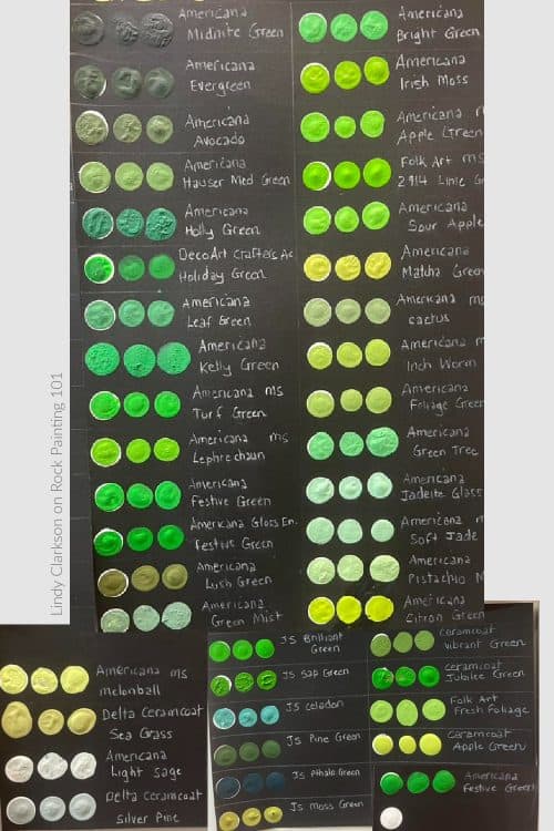
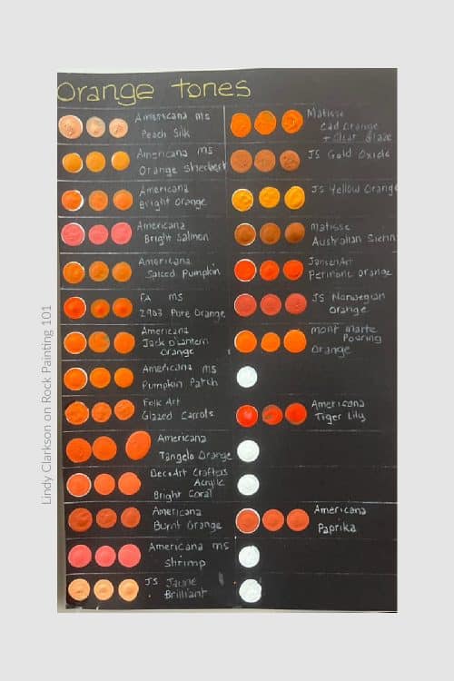
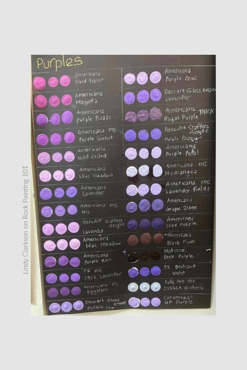
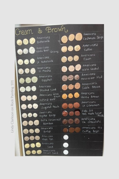
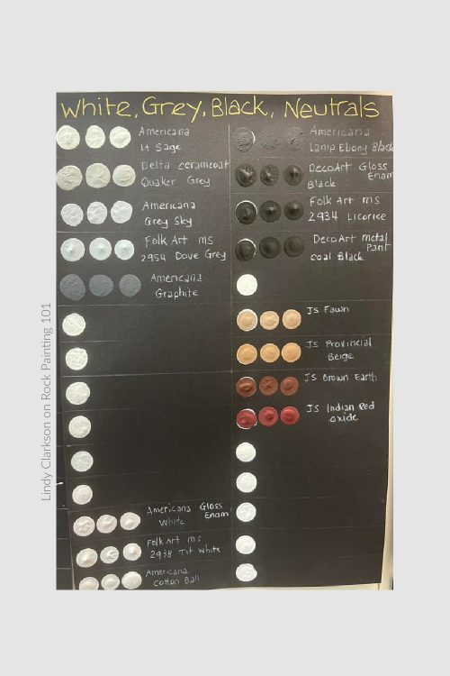
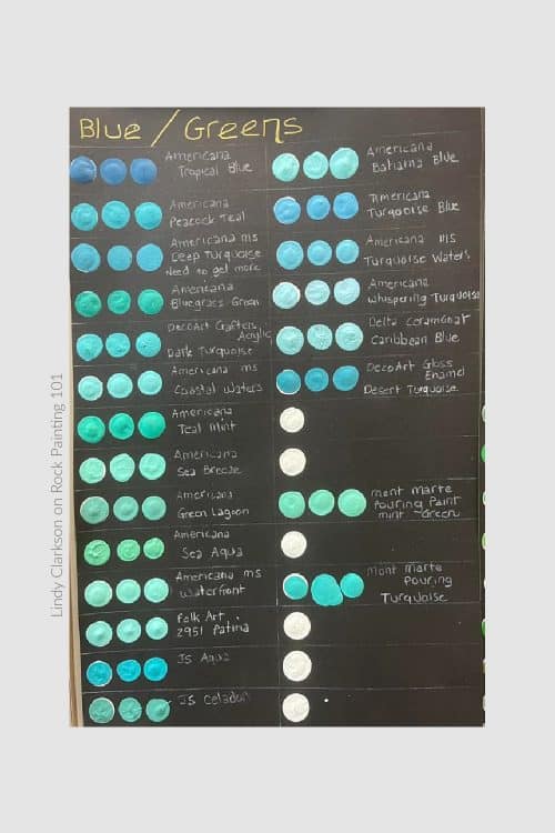
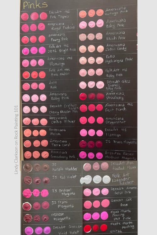
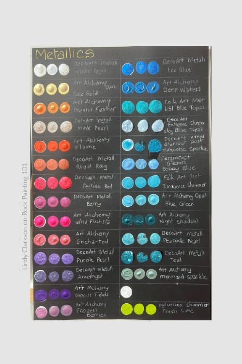
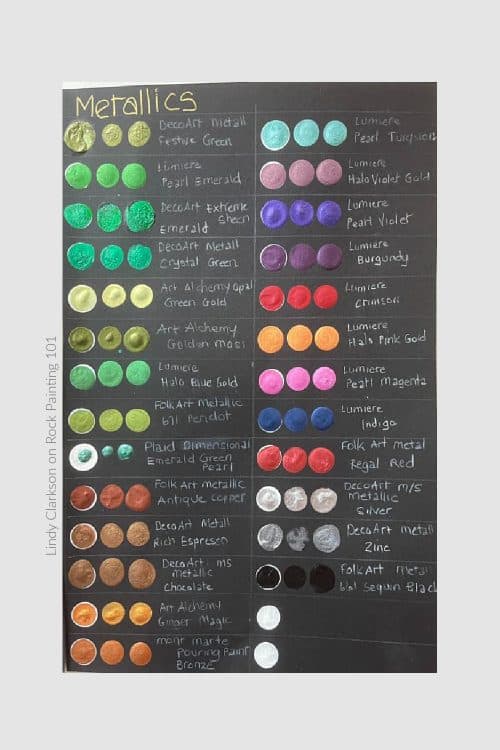
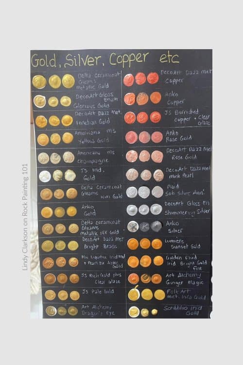
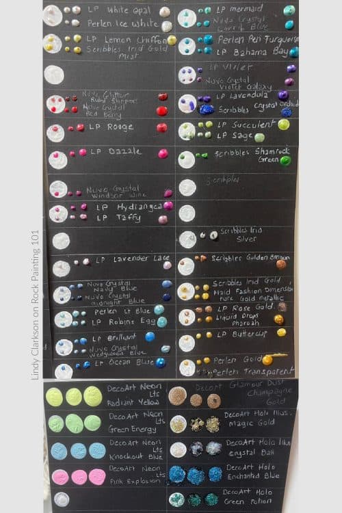
A few Notes from Lindy
I snagged a few quotes from her Facebook post. This will answer a few questions you may be asking when looking at the swatches below.
-On each page, the left hand swatch is done over a white dot, the middle dot of colour is one “press” with paint and the right hand side one is a “loaded” dot, where I have dotted the same paint several times to make it “puffy”.
-There is a good reason why most of them don’t show a lot of difference. I made a point of purchasing paints which say they are opaque, so there “should” be little difference between them. Some do have more transparency than others though.
-JS refers to Jo Sonja tube paints
-Lindy
Acrylic Paint – Primary Colors
Red Acrylic Paints
Yellow Acrylic Paints
Blue Acrylic Paints
Acrylic Paint – Secondary Colors
Green Acrylic Paints
Orange Acrylic Paints
Purple Acrylic Paints
Related: How to Improve Your Dotted Mandalas
Acrylic Paint – Extras
Neutrals and Skin Tone Acrylic Paint Colors
More Acrylic Paint Colors
Metallic Acrylic Paint Colors
Miscellaneous Acrylic Paint Colors
Shop for Acrylic Paint on Amazon
CLICK HERE to see ALL of our FAVORITE rock painting supplies!
Pin this to your favorite Pinterest craft board!
I hope this information was helpful! Take a minute and pin it to share and save it for later!